C6 Bank
About the Project
Company
C6 Bank
My role
Product Designer
Time spent
3 Weeks
Context
C6 Bank's card experience needed to handle hundreds of combinations between card and account states, from everyday actions to critical situations involving fraud and security.
This project focused on making those complex scenarios easier to understand and resolve, creating clearer communication and more direct paths to action.
The team
2 Product Designer
1 Design Lead
1 Data Analyst
1 Product Manager
2 Developers
1 Head
The problem
Users knew their card wasn't working.
They didn't always know why.
Customers could have their cards unavailable for several reasons, including fraud prevention, unpaid bills, user-initiated blocks, replacements, account status changes, and more.
The experience didn't always clearly communicate what had happened, why the card was unavailable, or what customers needed to do next. As a result, issues that could potentially be resolved through self-service were escalating to customer support and, in some cases, to complaints filed with Brazil's Central Bank.
Improving card communication and self-service became a business priority.
Understanding the complexity
One card.
Hundreds of possible scenarios.
We combined customer service data, complaints filed with Brazil's Central Bank, and internal card journeys to understand where customers were struggling and why.
What initially looked like a card status problem revealed a much more complex system.
A card status couldn't be understood in isolation. The same card state could require different communication or actions depending on the customer's account status.
The challenge was not to expose this complexity, but to design an experience that could handle it without making customers understand the system behind it.
From 500+ combinations to 7 macro states
From 500+ combinations to 7 macro states
Working closely with Product and Engineering, we structured the scenarios into a matrix and used AI to help identify patterns across the different combinations of account and card states.
This allowed us to consolidate hundreds of scenarios into seven macro states:
Active cards
Cards operating normally.
User blocked
Cards temporarily blocked by the customer
Preventive security
Temporary restrictions triggered by security checks.
Permanent security
Cards permanently blocked due to security decisions.
Replacement
First or second card replacement journeys.
Closed
Cards associated with closed or terminated accounts.
Bank blocked
Restrictions triggered by the bank due to account or card conditions.
Instead of designing hundreds of isolated experiences, these macro states gave us a shared framework for defining three things:
Context
What is happening?
Urgency
How much attention does it require?
Action
What should the customer do next?
Designing a contextual
Card Home
With the macro states defined, we redesigned the Card Home as a modular experience that could adapt its communication and actions to each customer's situation.
Instead of expecting customers to understand the reason behind a card issue and search for a solution, the interface could now surface the right context and the most relevant next action.

One component, four levels of urgency
Not every card issue requires the same level of attention.
We designed a semantic alert system that uses hierarchy and color to help customers quickly understand how urgent a situation is, while keeping the interaction pattern consistent across different scenarios.
Critical
Requires immediate attention or prevents the customer from using the card.
Alert
Important information that requires attention, but not necessarily immediate action.
Informational
Non-blocking messages and opportunities, such as creating a virtual card or adding it to a digital wallet.
Tracking
Progress updates related to card delivery.
Beyond this project
The project also became an opportunity to explore new visual patterns that could contribute to the evolution of C6 Bank's Design System.

Don't just explain the problem. Help resolve it.
Explaining the problem wasn't enough. We wanted to help customers resolve it.
Whenever possible, we connected each card status to the most relevant next action, allowing customers to go directly from understanding an issue to resolving it.
Instead of navigating through menus, customer support, or the AI chatbot to find the right journey, contextual CTAs could take customers directly to the step they needed.

Deep dive:
Fraud & card replacement
When the best interaction is no interaction
When a card is permanently blocked due to fraud, customers shouldn't have to figure out how to get a replacement.
We automated the happy path so that a new card can be issued immediately after the previous one is cancelled, requiring no action from the customer.
required to request a replacement in the automated flow.
If the customer doesn't already have a virtual card, the Card Home can also surface a contextual action to create one while the new physical card is on its way.

Designing for when automation fails
Automation introduced another question: what happens if the replacement cannot be issued automatically?
Instead of leaving customers without a clear next step, we used the same contextual alert system to surface a direct path into the existing replacement journey.
Customers can enter the flow in a single interaction and continue directly to the final personalization step.
5 → 1 interactions
to reach the replacement journey.
to reach the replacement journey.
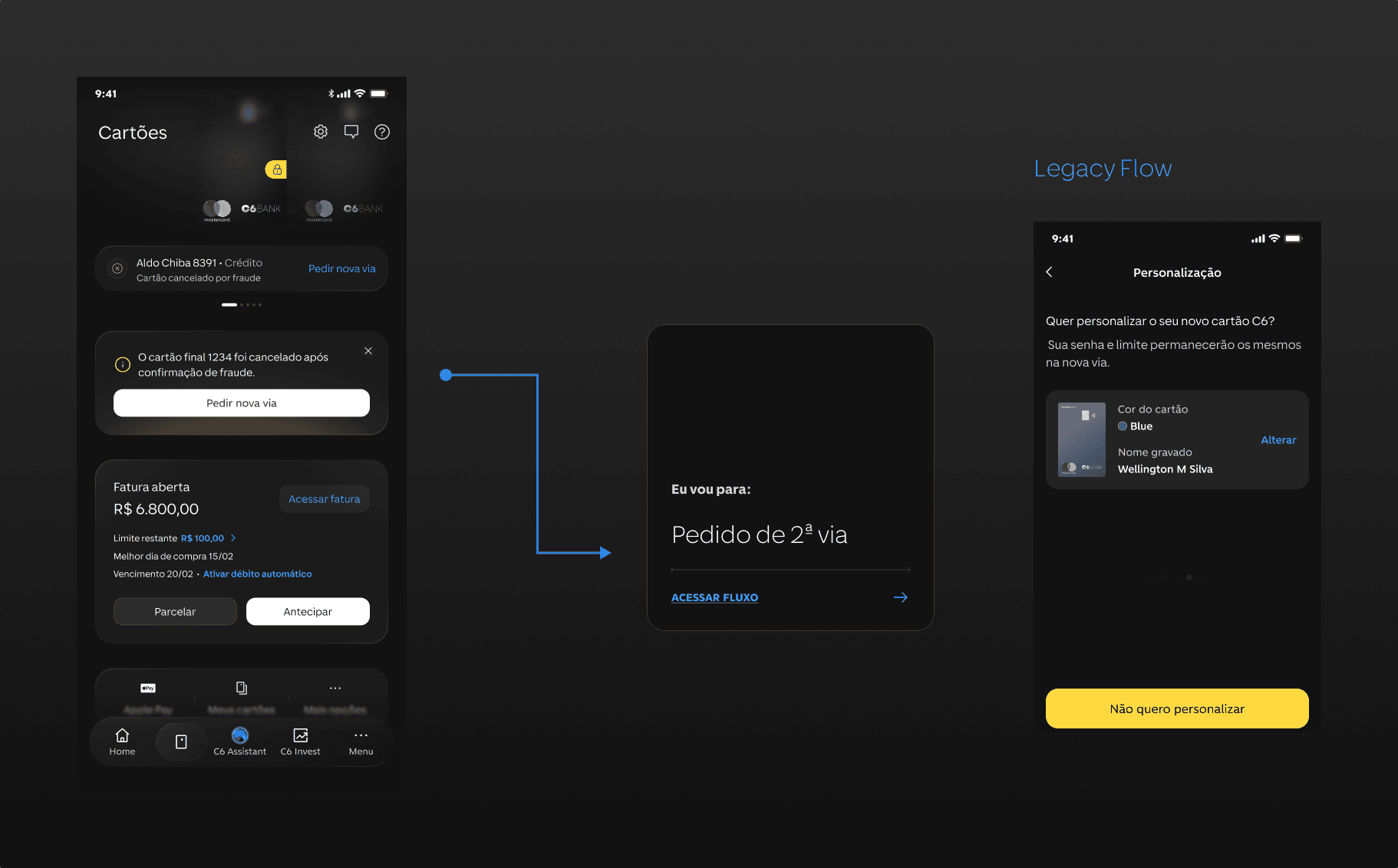
Working with legacy
Instead of rebuilding the existing replacement journey, we created a contextual entry point that reused the current flow and took customers directly to the relevant step.
Deep dive:
Suspicious purchases
Making suspicious purchase verification more direct
When a transaction is flagged as suspicious, speed and clarity become especially important.
Customers receive a WhatsApp message asking them to confirm whether they recognize the purchase. If they don't, the card is immediately blocked and a direct link takes them back to the app to review other potentially suspicious transactions.
Instead of asking customers to find the dispute journey themselves, the experience connects the security event directly to the next relevant action.
to reach the purchase verification journey.
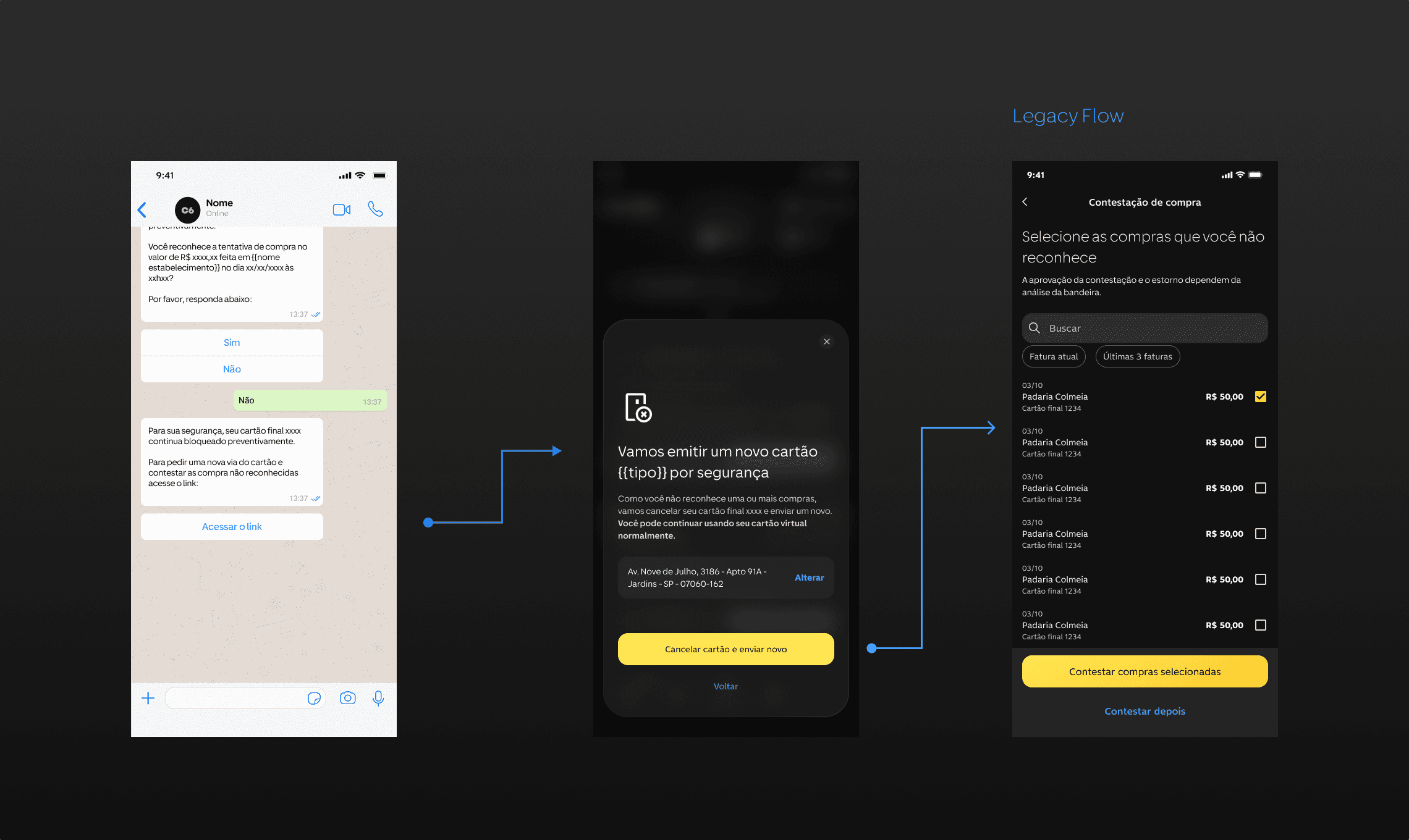
Bringing the verification back into the app
Not every customer completes the verification through WhatsApp.
For those cases, we designed an in-app fallback using an Action Sheet and the Card Alert component to prevent the security issue from becoming a dead end.
The customer can review the flagged purchase directly in the app. If they don't recognize it, the experience continues into the dispute journey, where they can review additional transactions.
The experience adapts to whether the customer responds externally or returns to the app, while preserving a clear path to resolution.

Simplifying before shipping
Our first direction for Card History tried to solve too many problems at once.
Alongside previous cards, we explored adding quick actions for temporary blocking, virtual card settings, replacement requests, and other card management features.
As the scope grew, we stepped back and revisited the original user need:
Customers needed a quick way to find and access information about their previous cards.
Instead of turning Card History into another card management hub, we simplified the experience around that core need.
The final solution provides a focused history of previous cards, while redirecting customers to existing card settings when additional actions are needed.
This kept the experience simpler, reduced unnecessary changes to legacy flows, and helped us stay within the three-week delivery window.
Reducing scope also reduced technical complexity.
Reusing existing card management journeys meant Engineering didn't need to modify additional legacy flows that weren't essential to solving the original problem.
A quick way to access information about previous cards.
Working within constraints
We had three weeks to improve seven card journeys as part of a broader effort to address customer frustration and reduce card-related complaints.
The timeline and business urgency didn't allow for a traditional round of user testing before release. Instead, we focused validation on the evidence and constraints available to us.
We compared existing and redesigned journeys, measured reductions in the number of interactions required to reach key actions, reviewed the experience with Product and Design leadership, and worked closely with Engineering to validate technical feasibility.
This meant making deliberate trade-offs: prioritizing the highest-impact problems, reusing existing journeys when possible, and avoiding changes to legacy systems that weren't essential to solving the customer problem.
How we validated decisions
Journey comparison
Existing vs. redesigned paths.
Interaction reduction
How many steps were required to reach key actions.
Product & Design review
Flow reviews with Product and Design leadership.
Technical feasibility
Flow reviews with Product and Design leadership.
These methods helped us make informed decisions under time pressure, but they did not replace user testing.
The timeline didn't allow for traditional user testing before release.
My role & collaboration
I worked as one of two Product Designers on an eight-person cross-functional team, collaborating closely with Product, Engineering, Data, and Design leadership.
Across the initiative, I helped translate business and technical constraints into clear customer journeys, working with the PM to define feasible experience paths within the three-week timeline.
My work included prototyping, design reviews with leadership, developer handoff, and implementation follow-up, with my strongest ownership focused on the card blocking and unblocking experience.
The solution was shaped collaboratively, especially where customer experience, business rules, and technical constraints intersected.
Shipped & expected impact
The redesigned card experiences were shipped to C6 Bank customers, introducing clearer status communication, contextual actions, and more direct paths to resolution.
Because the release was recent, post-launch performance data wasn't yet available when this case study was prepared.
The business target is a
related to card issues that previously lacked clear treatment within the app, while increasing the number of situations customers can resolve through self-service.
Clearer context
Customers can understand what is happening with their card directly from the Card Home.
More direct resolution
Contextual actions connect card issues to the relevant resolution journey.
More self-service
More card situations can be handled inside the experience without requiring customers to search for support.
Behind a single card status, there can be hundreds of combinations of account rules, security decisions, operational processes, and technical constraints.
Customers shouldn't need to understand that complexity.
For me, the biggest lesson from this project was learning how to turn complex system states into three simple things:
Context. Urgency. Action.
What happened, how much attention it requires, and what the customer can do next.
So, did you like it?
Get in touch with me so we can get to know each other better.